pixel&resolution(像素和分辨率)
reference
- What is pixel? – Definition from WhatIs.com (techtarget.com)
- What is resolution? – Definition from WhatIs.com (techtarget.com)
- What is a Pixel? – Definition from TechopediaWhat is a Pixel? – Definition from Techopedia
- MDN
像素和分辨率
- A pixel is represented by a dot or square on a computer monitor display screen.
- Pixels are the basic building blocks of a digital image or display and are created using geometric coordinates.
- Depending on the graphics card and display monitor, the quantity, size and color combination of pixels varies and
is measured in terms of(根据) the display resolution.- For example, a computer with a display resolution of 1280 x 768 will produce a
maximumof 98,3040 pixels on a display screen.(当一个pixel大小等同于一个dot的时候达到最多)
- For example, a computer with a display resolution of 1280 x 768 will produce a
- The
pixel resolutionspreadalsodetermines the quality of display;- more pixels
per inchof monitor screen yields better image results.- For example, a 2.1 megapixels(百万像素) picture contains 2,073,600 pixels since it has a resolution of 1920 x 1080.
- more pixels
- The
physical size of a pixelvaries, depending on the resolution of the display.- It will
equalthe size of the dot pitch if the display is set to itsmaximum resolution, - and will be
largerif the resolution is lower sinceeach pixel will use more dots. - Because of that, individual pixels may become visible, leading to a blocky and chunky image defined as “pixelated”.
- 也就是说,如果当一个图像像素占据了过多的屏幕物理点(dot),此时的一个pixel的大小显然会大于一个屏幕dot
- It will
- Pixels are
uniformly arrangedin a two-dimensional grid, although some different sampling patterns are available.- For example, in LCD screens the three main colors are sampled at different locations of a staggered grid(交错网格), while digital color cameras use a more regular grid.
- In computer monitors, pixels are square-shaped, meaning that their vertical and horizontal sampling pitches are equal.
- In other systems such as the anamorphic(可变性的) widescreen format of the 601 digital video standard, the shape of a pixel is rectangular.
- Each pixel has a unique logical address, a size of eight bits or more and, in most high-end display devices, the ability to project millions of different colors.
- The color of each pixel is determined by the specific blending of the three main components of the RGB color spectrum.
- Depending on the color system, a different number of bytes can be allocated for specifying each color component of the pixel.
- For example, in 8-bit color systems, only one byte is allocated per pixel, limiting the palette to just 256 colors.
- In the common 24-bit color systems used for nearly all PC monitors and smartphone displays, three bytes are allocated, one for each color of the RGB scale, leading to a total of 16,777,216 color variations.
- A 30-bit deep color system allocates 10 bits each of red, green, and blue for a total of 1.073 billion color variations.
- However, since the human eye cannot discriminate more than ten million colors, more color variations do not necessarily add more detail, and may even lead to color banding issues.
分辨率
- In computers, resolution is the number of pixels (individual points of color) contained on a display monitor, expressed in terms of the number of pixels on the horizontal axis and the number on the vertical axis. The sharpness of the image on a display depends on the resolution and the size of the monitor.
- The same pixel resolution will be sharper on a smaller monitor and gradually lose sharpness on larger monitors
because the same number of pixels are being spread out over a larger number of inches.(人口密度) - A given computer display system will have a maximum resolution that depends on its physical ability to focus light (in which case the physical dot size – the dot pitch – matches the pixel size) and usually several lesser resolutions.
- For example, a display system that supports a maximum resolution of 1280 by 1023 pixels may also support 1024 by 768, 800 by 600, and 640 by 480 resolutions.
- Note that on a given size monitor, the maximum resolution may offer a sharper image but be spread across a space too small to read well.
Display resolutionis not measured in dots per inch as it usually is with printers.- However, the
resolutionandthe physical monitor sizetogether dolet you determine the pixels per inch. - Typically, PC monitors have somewhere between 50 and 100 pixels per inch.
- For example, a 15-inch VGA (see display modes) monitor has a resolution of 640 pixels along a 12-inch horizontal line or about 53 pixels per inch.
- A smaller VGA display would have more pixels per inch.
屏幕像素
- 是指,屏幕上的一个点
像素&分辨率示例
譬如,我的设备屏幕硬件分辨率为1920*1080
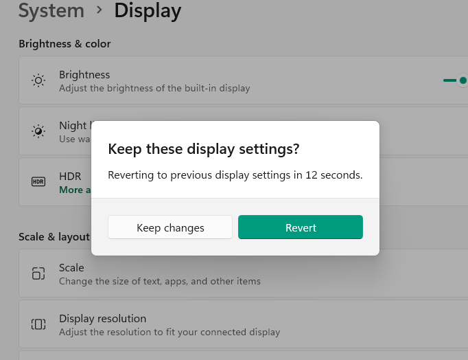
如果我调整分辨率
- 调整为1280*720:,那么此时屏幕上的各个元素(包括字体)都会变得很大,但这种放大会导致字体/窗口边界模糊,体验极差
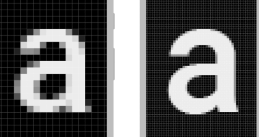
- windows输出的显示图像的信息量为1280*720,在不拉伸(不做铺满的情况下,虽然用不完整个屏幕,但是轮廓还是清晰的;但是windows将这
1280*720铺满至1920*1080,就导致图像信息单位面积内的信息量(信息密度)很低,所以看起来边界不清晰,出现马赛克(像素)化)
- windows输出的显示图像的信息量为1280*720,在不拉伸(不做铺满的情况下,虽然用不完整个屏幕,但是轮廓还是清晰的;但是windows将这
- 这是因为,显示的图像上的每个pixel都被一定程度的放大了,来铺满真个屏幕,覆盖整个屏幕(1920*1080)后,这时候,图像的1pixel大于物理设备的一个点(dot)的大小
图像像素
- A pixel is also known as a picture element (pix = picture, el = element)
- A pixel is
the basic logical unitin digital graphics. Pixels are combined to form a complete image, video, text, or any visible thing on a computer display. - A pixel is
the smallest unitof a digital image or graphic that can be displayed and represented on a digital display device. - 像素是指由图像的小方格组成的,这些小方块都有一个明确的位置和被分配的色彩数值,小方格颜色和位置就决定该图像所呈现出来的样子。
- 可以将像素视为整个
图像中不可分割的单位或者是元素。- 不可分割的意思是它不能够再切割成更小单位抑或是元素,它是以
一个单一颜色的小格存在。
- 不可分割的意思是它不能够再切割成更小单位抑或是元素,它是以
- 一个点阵图像包含了一定量的像素,这些像素决定图像在屏幕上所呈现的大小。
小结
-
一个像素到底有多大?
- 和显示图像的设备联系起来,设备上的点(dot)是固定的size;而一幅图像所具有的有效信息量是固定的(像素数量是固定的,像素大小可以被放大,但是像素数量还是那些)
- 当我们使用软件放大图像,图像上的像素就被放大,导致一个像素对应(占据)了更多的的物理dot;这些物理dot是实实在在的物理大小
-
具有高dpi的屏幕图像显示的关系
- 当一幅图像(S)信息量充分大(像素充分多,对应的图像分辨率也大),在一块好的高dpi屏幕A(屏幕物理大小规格为WH)上就更充分的表现细节(假设铺满屏幕)(屏幕A的分辨率上限大)
- 而一块低dpi屏幕B(屏幕物理大小规格也为WH),其分辨率上限小(整块屏幕含有的dot少于A屏幕);无法充分表现出原图片S的细节,同样铺满屏幕的情况下,这种情况下,屏幕B可能会采样来表示图片S
- 图片的分辨率大于设备分辨率或者小于设备的分辨率的显示问题
- 图像分辨率是一幅图片中像素的组成数量,如1024X768的图片,有1280X1024的图片,也有非常大的如2560X1600分辨率的图片等。
- 当图像的分辨率大于显示器的分辨率时有两种显示方法,一种是局部显示,即屏幕的像素有多少就显示多少像素,这时只能看到图片的某一部分,可以上下左右的移动来看完整的内容。另一种方法是在屏幕内显示完整的图像,这时图片的像素会被压缩,如2560X1600的图片会删去一部分像素,以1920X1080的分辨率(显示屏的分辨率)来显示。
- 这时可以看到完整的图片内容,不过在细节上是丢失一小部分像素的,如用 数码相机 的屏幕也可以看到完整的照片,不过感觉很模糊,放在电脑上看就好多了,因为屏幕的分辨率低。
css 像素
96pixel=1inch(这里的 pixel 和尺子上的长度可以直接挂钩)
开发中遇到的像素问题
使用密度无关像素(android)
-
您必须避免的第一个陷阱是使用像素来定义距离或尺寸。
-
使用像素来定义尺寸会带来问题,因为
不同的屏幕具有不同的像素密度(dpi:dot per inch;ppi:pixel per inch),所以同样数量的像素在不同的设备上可能对应于不同的物理尺寸(本征尺寸))。 -
尺寸相同的两个屏幕可能具有不同数量的像素
-
android 提供的解决方案:
- 要在密度不同的屏幕上保留界面的可见尺寸,您必须使用密度无关像素 (dp) 作为度量单位来设计界面。
- dp 是一个
虚拟像素单位,1 dp 约等于中密度屏幕(160dpi;“基准”密度)上的 1 像素。- 对于其他每个密度,Android 会将此值转换为相应的
实际像素数。
- 对于其他每个密度,Android 会将此值转换为相应的
将 dp 单位转换为像素单位
在某些情况下,您需要以 dp 表示尺寸,然后将其转换为像素。dp 单位转换为屏幕像素很简单:
px = dp * (dpi / 160)
- 假设在某一应用中,用户的手指至少移动 16 像素之后,系统才会识别出滚动或滑动手势。
- 在基线屏幕上,用户必须移动
16 pixels / 160 dpi(等于一英寸的 1/10 或 2.5 毫米,(基准密度屏幕上 160pixel=1inch=2.5cm;16pixel=0.25cm=2.5mm,)),系统才会识别该手势。 - 而在配备
高密度显示屏(240dpi) 的设备上,用户的手指必须至少移动16 pixels / 240 dpi,相当于 1 英寸的 1/15(1.7 毫米)。- 此距离短得多(1.75<2.5),因此用户会感觉应用在
该设备上更灵敏。
- 此距离短得多(1.75<2.5),因此用户会感觉应用在
css pixel & device pixel
-
One pixel. For screen displays, it traditionally represents one
device pixel (dot). -
However, for printers and high-resolution screens, one CSS pixel implies multiple device pixels.
1px= 1/96th of1inch. -
css pixel:实际应用中,当使用单位px时,让96px的距离等同(屏幕上的)大约 1 英寸就合格了- 无论屏幕的实际像素密度是多少。
-
The term CSS pixel is synonymous with the
CSS unitofabsolute lengthpx — which is normatively defined as being exactly1/96th of 1 inch.
references
- See also
- CSS: Cascading Style Sheets | MDN (mozilla.org)
- length – CSS(层叠样式表) | MDN (mozilla.org)
- resolution | MDN (mozilla.org)
- CSS Length Explained on the MDN Hacks Blog
px&dpi(device pixel & css pixel)
-
如果一个
屏幕的像素密度是 266 DPI,且屏幕上一个元素(比如一段文本<p>)的宽度是96px(css pxiel)=1 inch(譬如通过属性width=96px来设置),那么这个元素的实际宽度用设备像素(dot)来衡量是 266设备像素(device pixel)。dpi:图像每英寸长度内的像素点数。- DPI(Dots Per Inch,每英寸点数)是一个量度单位,用于点阵数码影像,
- 指每一英寸长度中,取样、可显示或输出点的数目。
- dpi越高,线条的表现可以越清晰(平滑)
Absolute length units
-
Absolute length units represent a physical measurement
when the physical properties of the output medium are known, such as for print layout. -
This is done by anchoring one of the units to a physical unit, and then defining the others relative to it.
-
The anchor is done differently for low-resolution devices, such as screens, versus high-resolution devices, such as printers.
-
For low-dpi devices, the unit
pxrepresents the physical reference pixel; other units are defined relative to it. -
Thus,
1inis defined as96px, which equals72pt. -
The consequence of this definition is that on such devices, dimensions described in inches (
in), centimeters (cm), or millimeters (mm) don’t necessary match the size of the physical unit with the same name.
For high-dpi devices, inches (in), centimeters (cm), and millimeters (mm) are the same as their physical counterparts. Therefore, the px unit is defined relative to them (1/96 of 1 inch).
Note: Many users increase their user agent’s default font size to make text more legible.
- Absolute lengths can cause accessibility problems, since they are fixed and do not scale according to user settings.
- For this reason, prefer relative lengths (such as
emorrem) when settingfont-size.
detail list of absolute length unit
px
One pixel. For screen displays, it traditionally represents one device pixel (dot). However, for printers and high-resolution screens, one CSS pixel implies multiple device pixels. 1px = 1/96th of 1in.
cm
One centimeter. 1cm = 96px/2.54.
mm
One millimeter. 1mm = 1/10th of 1cm.
Q
One quarter of a millimeter. 1Q = 1/40th of 1cm.
in
One inch. 1in = 2.54cm = 96px.
pc
One pica. 1pc = 12pt = 1/6th of 1in.
pt
One point. 1pt = 1/72nd of 1in.
Relative length units
Relative lengths represent a measurement in terms of some other distance. Depending on the unit, this can be the size of a specific character, the line height, or the size of the viewport.
Font-relative lengths
Font-relative lengths define the <length> value in terms of the size of a particular character or font attribute in the font currently in effect in an element or its parent.
Note: These units, especially em and rem, are often used to create scalable layouts, which maintain the vertical rhythm of the page even when the user changes the font size.
-
capRepresents the “cap height” (nominal height of capital letters) of the element’s font.
-
chRepresents the width, or more precisely the advance measure, of the glyph “0” (zero, the Unicode character U+0030) in the element’s font.In the cases where it is impossible or impractical to determine the measure of the “0” glyph, it must be assumed to be 0.5em wide by 1em tall.
-
emRepresents the calculated font-size of the element. If used on the font-size property itself, it represents the inherited font-size of the element.
-
exRepresents the x-height of the element’s font. On fonts with the “x” letter, this is generally the height of lowercase letters in the font;
1ex ≈ 0.5emin many fonts. -
icEqual to the used advance measure of the “水” glyph (CJK water ideograph, U+6C34), found in the font used to render it.
-
lhEqual to the computed value of the line-height property of the element on which it is used, converted to an absolute length.
-
remRepresents the font-size of the root element (typically ). When used within the root element font-size, it represents its initial value (a common browser default is16px, but user-defined preferences may modify this). -
rlhEqual to the computed value of the line-height property on the root element (typically ), converted to an absolute length. When used on the font-size or line-height properties of the root element, it refers to the properties’ initial value.
Viewport-percentage lengths
Viewport-percentage lengths define the <length> value relative to the size of the viewport, i.e., the visible portion of the document. Viewport lengths are invalid in @page declaration blocks.
-
vhEqual to 1% of the height of the viewport’s initial containing block.
-
vwEqual to 1% of the width of the viewport’s initial containing block.
-
viEqual to 1% of the size of the initial containing block, in the direction of the root element’s inline axis.
-
vbEqual to 1% of the size of the initial containing block, in the direction of the root element’s block axis.
-
vminEqual to the smaller of
vwandvh. -
vmaxEqual to the larger of
vwandvh.
CSS resolution
分辨率:用于描述媒体查询中的分辨率的 <resolution> CSS数据类型表示输出设备的像素密度。
在屏幕上,单位与CSS英寸,厘米或像素有关,而与物理值无关。
Syntax
数据类型由严格为正
组成,后跟下面列出的单位之一。与所有CSS维度一样,单位字面值与数字之间没有空格。
单位
-
dpi
表示每英寸的点数。屏幕通常每英寸包含72或96个点,但打印文档的dpi通常要大得多。 1英寸是2.54厘米,1dpi≈0.39dpcm。
-
dpcm
每厘米上的点数。1英寸是2.54厘米, 1dpcm ≈ 2.54dpi.
-
dppx
表示每个px的点数。 由于CSS px的固定比率为1:96,因此1dppx相当于96dpi。
- which corresponds to the default resolution of images displayed in CSS as defined by image-resolution (en-US).
-
x
dppx 的别名
Note: Although the number 0 is always the same regardless of unit, the unit may not be omitted. In other words, 0 is invalid and does not represent 0dpi, 0dpcm, or 0dppx.
Examples
- Examples
Use in a media query
- Use in a media query
@media print and (min-resolution: 300dpi) { ... }
Valid resolutions
- Valid resolutions
96dpi
50.82dpcm
3dppx
Invalid resolutions
- Invalid resolutions
72 dpi     Spaces are not allowed between the number and the unit.
ten dpi    The number must use digits only.
0          The unit is required.
今天的文章分辨率pixels什么意思_毫米像素转换器分享到此就结束了,感谢您的阅读。
版权声明:本文内容由互联网用户自发贡献,该文观点仅代表作者本人。本站仅提供信息存储空间服务,不拥有所有权,不承担相关法律责任。如发现本站有涉嫌侵权/违法违规的内容, 请发送邮件至 举报,一经查实,本站将立刻删除。
如需转载请保留出处:https://bianchenghao.cn/89114.html


