
转载自:http://blog.csdn.net/lilanfeng1991/article/details/
1. qplot
quick plot
数据集:diamonds
(1)基本用法
eg
- library(ggplot2)
- length(diamonds)
- set.seed(1410)#设定种子数
- dsmall<-diamonds[sample(nrow(diamonds),100),]#随机产生样本数
- qplot(carat,price,data=diamonds)#画散点图

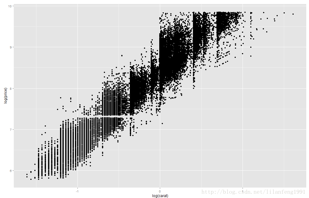
- qplot(log(carat),log(price),data=diamonds)
color、size、shape
- qplot(carat,price,data=dsmall,colour=color)

- qplot(carat,price,data=dsmall,shape=cut)

- <span style="font-family: Arial, Helvetica, sans-serif;">qplot(carat,price,data=dsmall,alpha=I(1/20))</span>

(2)geom
取值可以为:point、smooth、boxplot、path、line
对于连续型变量:geom可取histogram、freqpoly、density
对于离散型变量:bar
- qplot(carat,price,data=dsmall,geom=c("point","smooth"))

- qplot(carat,price,data=dsmall,geom=c("point","smooth"),span=0.2)

- qplot(carat,price,data=dsmall,geom=c("point","smooth"),span=1)

2.ggplot2
| 数据(Data)和映射(Mapping) | 将数据中的变量映射到图形属性,映射控制了二者之间的关系 |
| 标度(Scale) | 标度负责控制映射后图形属性的显示方式,具体形式上看是图例和坐标刻度 |
| 几何对象(Geometric) | 几何对象代表我们在图中实际看到的图形素,如点、线、多边形等 |
| 统计变换(Statistics) | 对原始数据进行某种计算,如对二菜点图加上一条回归线 |
| 坐标系统(Coordinate) | 坐标系统控制坐标轴并影响所有图形素,坐标轴可以进行变换以满足不同的需要 |
| 图层(Layer) | 数据、映射、几何对象、统计变换等构成一个图层,图层可以允许用户一步步的构建图形,方便单独对图层进行修改 |
| 分面(Facet) | 条件绘图,将数据按某种方式分组,然后分别绘图。分布就是控制分组绘图的方式和排列形式 |
(1)geom_point
- mpg
- head(mpg)
- p<-ggplot(data=mpg,mapping=aes(x=cty,y=hwy))
- p+geom_point()
- summary(p)
- summary(p+geom_point())

- #将年份映射到颜色属性
- p<-ggplot(mpg,aes(x=cty,y=hwy,colour=factor(year)))
- p+geom_point()

(2)增加平滑线
- p+geom_point()+stat_smooth()

- p<-ggplot(mpg,aes(x=ctymy=hwy))
- p+geom_point(aes(colour=factor(year)))+stat_smooth()
(3)两种等价的绘图方式
- #方法一
- p<-ggplot(mpg,aes(x=cty,y=hwy))
- p+geom_point(aes(colour=factor(year)))+stat_smooth()
- #方法二
- d<-ggplot()+
- geom_point(data=mpg,aes(x=cty,y=hwy,colour=factor(year)))+
- stat_smooth(data=mpg,aes(x=cty,y=hwy))#此时除了底层画布外,有两个图层,分别定义了geom和stat
(4)用标度来修改颜色取值
- p<-ggplot(mpg,aes(x=cty,y=hwy))
- p+geom_point(aes(colour=factor(year)))+stat_smooth()+scale_color_manual(values=c("blue","red"))

(5)将排量映射到散点大小
- p+geom_point(aes(colour=factor(year),size=displ))+
- stat_smooth()+
- scale_color_manual(values=c("blue2","red4"))

- p+geom_point(aes(colour=factor(year),size=displ),alpha=0.5,position="jitter")+
- stat_smooth()+
- scale_color_manual(values=c("blue2","red4"))+
- scale_size_continuous(range=c(4,10))

(6)用坐标控制图形显示的范围
- p+geom_point(aes(colour=factor(year),size=displ),alpha=0.5,position="jitter")+
- stat_smooth()+
- scale_color_manual(values=c("blue2","red4"))+
- scale_size_continuous(range=c(4,10))+
- coord_cartesian(xlim=c(15,25),ylim=c(15,40))

(7)利用facet分别显示不同年份的数据
- p+geom_point(aes(colour=class,size=displ),alpha=0.5,position="jitter")+
- stat_smooth()+
- scale_size_continuous(range=c(4,10))+
- facet_wrap(~year,ncol=1)

(8)增加图名并精细修改图例
- p<-ggplot(mpg,aes(x=cty,y=hwy))
- p+geom_point(aes(colour=class,size=displ),alpha=0.5,position="jitter")+
- stat_smooth()+
- scale_size_continuous(range=c(4,10))+
- facet_wrap(~year,ncol=1)+
- opts(title='汽车油耗与型号')+
- labs(x="每加仑高速公路行驶距离",y="每加仑城市公路行驶距离")+
- guides(size=guide_legend(title="排量"),colour=guide_legend(titile="车型",override.aes=list(size=5)))

(9)直方图
- p<-ggplot(mpg,aes(x=hwy))
- p+geom_histogram()

直方图的几何对象中内置有默认的统计变换
- p+geom_histogram(aes(fill=factor(year),y=..density..),alpha=0.3,colour="black")+
- stat_density(geom="line",position="identity",size=1.5,aes(colour=factor(year)))+
- facet_wrap(~year,ncol=1)

(10)条形图
- p<-ggplot(mpg,aes(x=class))
- p+geom_bar()

- class2<-mpg$class
- class2<-reorder(class2,class2,length)
- mpg$class2<-class2
- p<-ggplot(mpg,aes(x=class2))
- p+geom_bar(aes(fill=class2))

- p<-ggplot(mpg,aes(class2,fill=factor(year)))
- p+geom_bar(position="identity",alpha=0.5)

并立方式
- p+geom_bar(position="dodge")

叠加方式
- p+geom_bar(position="stack")

相对比例
- p+geom_bar(position="fill")

分面显示
- p+geom_bar(aes(fill=class2))+facet_wrap(~year)

(11)饼图
- p<-ggplot(mpg,aes(x=factor(1),fill=factor(class)))+geom_bar(width=1)
- p+coord_polar(theta="y")

(12)箱线图
- p<-ggplot(mpg,aes(class,hwy,fill=class))
- p+geom_boxplot()

- p+geom_violin(alpha=0.3,width=0.9)+geom_jitter(shape=21)

3.观察密集散点的方法
增加扰动(jitter)
增加透明度(alpha)
二维直方图(stat_bin2d)
密度图(stat_density2d)
- p<-ggplot(diamonds,aes(carat,price))
- p+stat_bin2d(bins=60)

- p+stat_density2d(aes(fill=..level..),geom="polygon")+
- coord_cartesian(xlim=c(0,1.5),ylim=c(0,6000))+
- scale_fill_continuous(high="red2",low="blue4")

4.风向风速玫瑰图
- #随机生成100次风向,并洪到16个敬意内
- dir<-cut_interval(runif(100,0,360),n=16)
- #随机生成100次风速,并划分成4种强度
- mag<-cut_interval(rgamma(100,15),4)
- sample<-data.frame(dir=dir,mag=mag)
- #将风向映射到x轴,频数映射到y轴,风速大小映射到填充色,生成条形图后再转为极坐标形式即可
- p<-ggplot(sample,aes(x=dir,y=..count..,fill=mag))
- p+geom_bar()+coord_polar()

今天的文章 R语言之ggplot2画图篇分享到此就结束了,感谢您的阅读。
版权声明:本文内容由互联网用户自发贡献,该文观点仅代表作者本人。本站仅提供信息存储空间服务,不拥有所有权,不承担相关法律责任。如发现本站有涉嫌侵权/违法违规的内容, 请发送邮件至 举报,一经查实,本站将立刻删除。
如需转载请保留出处:https://bianchenghao.cn/bian-cheng-ji-chu/88884.html